
There are three parts to this Lecture (which mostly consists of problems for you to work through). The first is to understand what the graph of the logarithm function looks like. The second is to see how using a log scale affects a graph of another function mathematically. The third part is to see how this can work with practical data.
The graph of the logarithm function
For these problems on graphing, ideally you will have some graph paper available. If you don’t, and you have a printer, there are a number of sites that offer free pdfs of graph paper that you can print out. If you have neither, you can use blank or lined paper and a ruler.
The graphs should be somewhat careful and accurate, but don’t have to be super-accurate.
I would prefer that you do not use a computer to make these graphs. Creating the tables and the graphs by hand helps give you an intuition for them, that you don’t get the same way on the computer. However, if you are really stuck for supplies, or have issues that make graphing on paper impossible, a computer graphing program could be used as a last resort.
Problem 1: You have already created a table of values for y=log x, where the x ranges through 1, 2, 3, …, 10. Use these values to make a graph of y=log x, wher x ranges from 0 to 10. Try to plot fairly carefully. Choose a range for your y-axis which makes the graph a reasonable size, then split up that range into equal parts (in an additive scale!). Plot the points, then connect them with a continuous curve. (We haven’t addressed what happens with log 0, so your graph will actually start at x=1. If you don’t know already, you might make guesses about what happens to the left of x=1.)
Problem 2: Make a graph of y=log x, for an x range of 0 to 100. Figure out how much y range you need, and then pick your y scale accordingly. Be sure to use an ordinary linear scale for the x and y axes. Make a table of values, for a reasonable number of x values. I would suggest computing the values of log x mentally, to give you practice, but you can check them on a calculator.
Problem 3: Make a graph of y=log x, for an x range of 0 to 10,000. What is this telling you about the logarithm function?
Using a log scale to transform other graphs
A common application of logarithms is to transform data. I would like you to see how it works with exact mathematical functions first; then we’ll try it on empirical data.
Problem 4: Make a graph of the function  . Make your x range from 0 to 10. Figure out how big a y range you need, before you start graphing! Make your table of values first. Make your y range so the biggest value will fit on your page, then split up your y scale accordingly. Be sure to use an ordinary linear scale for your y axis (going up by constant additive steps).
Problem 5: Now, I want to make another graph of , but this time I want to use a logarithmic scale for the y axis. The top of your scale will be 1000. Then, you should mark 1, 10, 100, and 1000, with even spacing between each. I’d like you to mark the halfway point between each of these markings as well; according to what we did before, what numbers should those be labelled with? Now, use your same table of values for , and plot the points.
Problem 6: I want to make one more graph of . This time, though, I want to graph, not y, but log y. On your table of values, for each value of y, find log y. See what the biggest value of log y is, and pick a range for your vertical axis accordingly. Split up your vertical axis in a linear scale (so if 3 is your top, then 0, 1, 2, and 3 should be evenly spaced on your vertical axis). Now plot the points: plot x versus log y, where . Compare this to the previous problem; what is the difference?
Using a log scale to transform real-world data
In class, I introduced you to the gapminder.org site. They have an amazing array of real-world data, and data visualization tools that you can use.
Here is life expectancy as a function of income (measured as GDP per person, adjusted for purchasing power; click on “Data Doubts” at the bottom right of the graph on their site for more details):

Note that the data is all crowded towards the left side of the graph. More significantly, the x axis is not really evenly spaced in practical terms. It is evenly spaced mathematically, additively: each marking is the equivalent purchasing power of 20,000 US dollars. So the spacing is 0, 20,000, 40,000, 60,000, 80,000,… But this isn’t evenly spaced in terms of life realities. There is a vast difference between living on 1,000 a year and 21,000 a year; that difference is far greater than the difference of living on 80,000 a year versus 100,000 a year. The additive difference is the same in both cases; but what is practically more relevant is the percentage changes, or multiplicative difference.
When you in a situation where percentage or multiplicative differences are the important thing, it is usually a good idea to use a log scale for that variable–or, equivalently, to graph the log of that variable. What is practically important is not the income, but the log of the income.
The reason is that we really only understand additive changes well; if something behaves by multiplicative changes, then it is usually a good idea to use the logarithm to convert multiplicative changes to additive changes, which we can see better.
We can do this on the gapminder graph by selecting the little arrow next to the “Income” label on the x-axis, and selecting a “log” rather than “linear” scale:
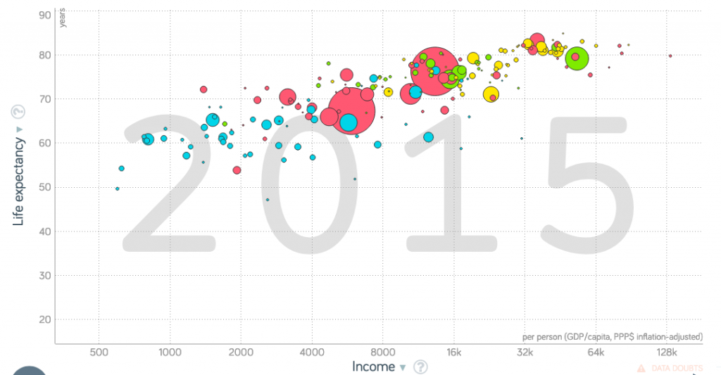
Now, there is a linear trend apparent in the data. This means that any fixed percentage increase in income will, on average, create the same additive change in life expectancy. People often express this as doubling: each doubling of income adds xxxx years to life expectancy, on average.
Now, you might wonder why I didn’t use a log scale for life expectancy. Practically speaking, it seems that life expectancy is really a linear thing: each additional year is an additional year. It’s not so dependent on percentage changes as income is. However, this is a somewhat subjective judgment call in many cases, and it can depend on what you’re trying to see in the data.
Problem 7: In the second graph shown above, find the log of each marking on the x axis. In this way, verify that the x axis is additively evenly spaced if we are showing log x (i.e. log income), rather than x itself.
Problem 8: If you click on the axis labels on the graph in gapminder, you find that there are wide variety of different variables that they have data for, and which you can graph. Select two variables to graph (other than life expectancy versus income), on the following criteria:
– one variable should seem to you that it is multiplicative in its practical nature: that percentage changes in that variable matter more than absolute changes
– the other variable should seem to you that it is additive in its practical nature
– the two variables and their relationship should seem interesting to you
Pick one of the variables to be x, and the other y. (Usually the convention is to make y the variable that you think of as “dependent”: you are thinking of the y as depending on the x. In the real world, of course, the causal direction may not be that simple, but make a judgment there.) Make two graphs: make one with a linear scale for both variables; make another with a log scale for the variable you think is multiplicative, while keeping a linear scale for the variable you think is additive.
Take a screenshot of each graph so you can refer back to them. Explain what you think is differently visible in each graph.
Problem 9: The same thing as Problem 8, but this time, pick two variables for which you expect both of them to be multiplicative. This time, make three graphs: one with linear scales for both variables; one with a linear scale for one variable, log for the other; and finally, one with log scales for both. As before, take screenshots, and compare the results.